Component Showcase
Reference for all available documentation components. Each section shows usage instructions, the CMS syntax, and a live preview with light/dark mode toggle.
Headings
Use headings to organize content hierarchy. In the CMS, H1 is automatically converted to H2.
Syntax
# Heading 1 (renders as H2)

## Heading 2

### Heading 3

#### Heading 4Text Formatting
Standard markdown formatting for emphasis, strikethrough, and inline code.
Syntax
This is **bold text** and this is *italic text*.

This is ***bold and italic*** together.

This is ~~strikethrough~~ text.

This is `inline code` within a sentence.This is bold text and this is italic text.
This is bold and italic together.
This is strikethrough text.
This is inline code within a sentence.
Links
Standard markdown links. External links open in a new tab automatically.
Syntax
[Regular link](https://applivery.com)

[External link](https://github.com)This is a regular link and this is an external link.
Lists
Unordered and ordered lists with nesting support.
Syntax
- First item
- Second item
  - Nested item A
  - Nested item B
- Third item

1. First step
2. Second step
   1. Sub-step A
   2. Sub-step B
3. Third step- First item
- Second item
- Nested item A
- Nested item B
- Third item
- First step
- Second step
- Sub-step A
- Sub-step B
- Third step
Blockquote
Use blockquotes for citing sources or highlighting important passages.
Syntax
> This is a blockquote with **bold** and `code`.
>
> It can span multiple paragraphs.This is a blockquote with bold and
code.It can span multiple paragraphs.
Tables
Standard markdown tables for structured data.
Syntax
| Property | Type   | Required | Description        |
|----------|--------|----------|--------------------|
| name     | string | Yes      | The display name   |
| email    | string | Yes      | Contact email      |
| role | enum | No | User role || Property | Type | Required | Description |
|---|---|---|---|
| name | string | Yes | The display name |
| string | Yes | Contact email | |
| role | enum | No | User role (admin, editor, viewer) |
| active | boolean | No | Whether the user is active |
Code Block
Fenced code blocks with optional language for syntax highlighting.
Syntax
```
Plain code block without highlighting.
```

```javascript
const greeting = "Hello, World!";
console.log(greeting);
```Plain code block without highlighting.
const greeting = "Hello, World!";
console.log(greeting);
Code Block with Filename
Add a title attribute to display a filename header with a copy button.
Syntax
```typescript title="src/config.ts"
interface AppConfig {
  apiUrl: string;
  debug: boolean;
}
```
src/config.ts
interface AppConfig {
  apiUrl: string;
  debug: boolean;
  version: string;
}

export const config: AppConfig = {
  apiUrl: "https://api.applivery.com",
  debug: false,
  version: "1.0.0",
};
Callouts
Admonition blocks to highlight important information. Available types: note, info, tip, success, important, warning, danger, caution.
Syntax
:::note
Highlights information that users should take into account.
:::

:::tip
Optional information to help a user be more successful.
:::

:::important
Crucial information necessary for users to succeed.
:::

:::warning
Critical content demanding immediate user attention.
:::

:::caution
Negative potential consequences of an action.
:::Note
Highlights information that users should take into account, even when skimming.
Tip
Optional information to help a user be more successful.
Success
Operation completed successfully. Your changes have been saved.
Important
Crucial information necessary for users to succeed.
Warning
Critical content demanding immediate user attention due to potential risks.
Caution
Negative potential consequences of an action.
Accordion
Collapsible sections for content that can be expanded on demand.
Syntax
<Accordion title="Click to expand">
Your content here with **markdown** support.

- List items work too
- Another item
</Accordion>Applivery is a platform for mobile device management and app distribution. It supports Android, iOS, and Windows devices.
You can use it to:
- Manage device policies
- Distribute apps
- Monitor compliance
Sign up for a free account at applivery.com and follow the onboarding guide.
Tabs
Tabbed content for showing alternatives like code in multiple languages.
Syntax
<Tabs>
<Tab title="JavaScript">
\`\`\`javascript
const data = await fetch("/api");
\`\`\`
</Tab>
<Tab title="Python">
\`\`\`python
response = requests.get("/api")
\`\`\`
</Tab>
</Tabs>const response = await fetch("https://api.applivery.com/v1/devices");
const data = await response.json();
console.log(data);
import requests

response = requests.get("https://api.applivery.com/v1/devices")
data = response.json()
print(data)
curl -X GET "https://api.applivery.com/v1/devices" \
  -H "Authorization: Bearer YOUR_API_KEY"
Steps
Numbered step-by-step guides with titles and content for each step.
Syntax
<Steps>
<Step title="Create an account">
Go to applivery.com and sign up.
</Step>
<Step title="Install the SDK">
\`\`\`bash
npm install @applivery/sdk
\`\`\`
</Step>
</Steps>1
Create an account
Go to applivery.com and sign up for a free account. You will need a valid email address.
2
Install the SDK
Install the Applivery SDK in your project using your preferred package manager.
npm install @applivery/sdk
3
Configure your app
Initialize the SDK with your API key and configure the settings for your application.
4
Deploy
Build and deploy your application. The SDK will handle updates automatically.
Cards
Card components for linking to related pages. Use CardGroup to arrange in columns (1-4). Available icons: rocket, smartphone, zap, code, shield, users, file-text, settings, book, globe, database, lock, star, heart, bell, mail, terminal, and more.
Syntax
<Card title="Getting Started" icon="rocket" href="/en/guides">
Learn the basics of the platform.
</Card>

<CardGroup cols={2}>
<Card title="Devices" icon="smartphone" href="/en/devices">
Manage all your devices.
</Card>
<Card title="Apps" icon="zap" href="/en/apps">
Distribute apps to your team.
</Card>
</CardGroup>

<CardGroup cols={3}>
<Card title="API" icon="code">
Full REST API docs.
</Card>
<Card title="Security" icon="shield">
Security best practices.
</Card>
<Card title="Users" icon="users">
Manage user access.
</Card>
</CardGroup>Getting Started
Learn the basics of the platform and set up your first project.
Device Management
Manage Android, iOS, and Windows devices from a single console.
App Distribution
Distribute apps to your team with over-the-air updates.
API Reference
Full REST API documentation with examples.
Security
Security best practices and compliance.
Users & Teams
Manage user access and team permissions.
API Endpoint
Display API endpoint badges with method and path. Used in API reference pages.
Syntax
<APIEndpoint method="GET" path="/v1/devices">
Returns a list of all managed devices.
</APIEndpoint>

<APIEndpoint method="POST" path="/v1/devices/{id}/commands">
Send a command to a specific device.
</APIEndpoint>

<APIEndpoint method="DELETE" path="/v1/devices/{id}">
Remove a device from the organization.
</APIEndpoint>GET
/v1/devicesReturns a list of all managed devices in the organization.
POST
/v1/devices/{deviceId}/commandsSend a command to a specific device.
DELETE
/v1/devices/{deviceId}Remove a device from the organization.
Browser Mockup
A browser frame wrapper for previewing dashboard UIs or web content. Supports light, dark, and auto themes.
Syntax
<BrowserMockup url="https://dashboard.applivery.com" theme="auto">

### Dashboard Preview

Content rendered inside a browser chrome frame.

| Status  | Count |
|---------|-------|
| Online  | 142   |
| Offline | 23    |

</BrowserMockup>Welcome to the Dashboard
This is a preview of what the Applivery dashboard looks like. You can manage all your devices, apps, and policies from here.
| Status | Count |
|---|---|
| Online | 142 |
| Offline | 23 |
| Pending | 7 |
Annotated Image
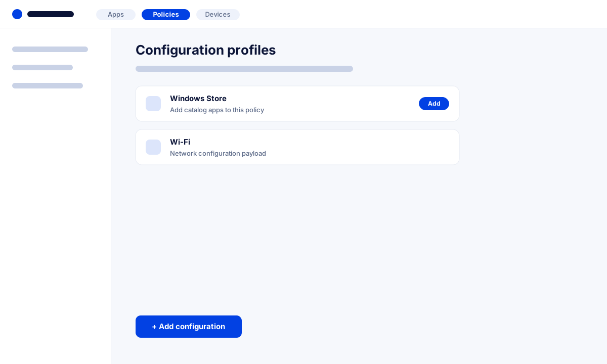
A clean screenshot with a data-driven marker overlay. Nothing is baked into the pixels — pins and rectangles are positioned in percentages, and each marker reveals a tooltip on click. Use accent="blue" to switch from annotation red to brand blue.
Syntax
<AnnotatedImage src="/screenshot.png" alt="Policies screen" markers='[
  {"n":1,"shape":"pin","x":27.3,"y":4,"title":"Open Policies","body":"Go to the **Policies** tab to manage configuration profiles."},
  {"n":2,"shape":"rect","x":22.3,"y":86.7,"w":17.5,"h":6.1,"title":"Add configuration","body":"Use **Add configuration** to attach a new payload."},
  {"n":3,"shape":"rect","x":22.3,"y":23.6,"w":53.3,"h":9.7,"title":"Windows Store payload","body":"Search the catalog, then click **Add** to include it."}
]'></AnnotatedImage>